Interview Challenge
Date: 2016
The goal of this challenge was to create a very simple expense tracking app. But there were restrictions: there are only three actions a user could do. The designer was asked to choose the actions and to design the user experience. The app should be for a native iOS or Android app.
Competitors - Short Analysis
I started this challenge with a short and quickly analysis about hypothetic competitors. Basically, I decided to split this research into two group. One was a group of Apps which doesn't sync with the user’s bank account. The user has to manually enter all transactions like deposits, expenses, and credit card debts. Many of these apps also give you the possibility to take a photo of your receipts. The scanner reads all relevant information from your receipt and creates the transaction input. The other group of Apps is intuitively organised to give the user the big picture of their finances. This group is interesting because it syncs all your accounts. In this way the apps have access to all your bank transactions, outlining budget and savings goals. There is also the possibility for the user to see their cash flow in real time, including deposits, expenses, credit card debts, and other investments. Everything is shown through a set of nice analysis elements and helped with smart-recommendation.
Persona
In this case the user is a young 28-year-old man who has 2 bank accounts, 1 from Italy where he has a debit card connected directly to his current account and a bank card. The second bank account is German with a linked debit card. He also has a Pay Pal debit card. The user would like to have the possibility to control all his accounts without having to use different apps.
Concept
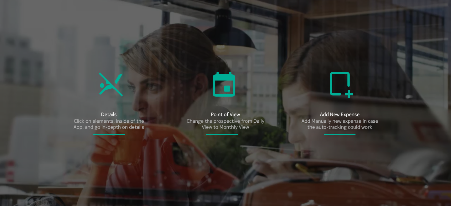
The Idea is to offer a service to to Help the user, and Control his Expenses, with the possibility to Track Different Accounts in real-time, Change Point of View on the status of all expenses, and provide In-Depth information on transactions.


Action in Background
To develop the Challenge I have considered actions like: Swipe to gauge screen, click, search and manage account fro the setting, actions which there are in background of the idea.
Details
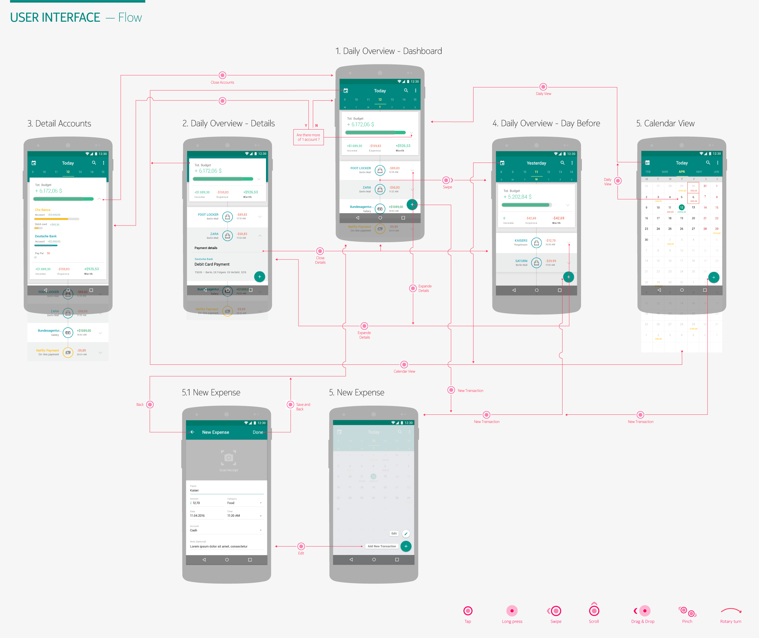
Daily View: When the user opens the app, he enter the daily view directly. Here, the user can see all information about transactions fo that day. The idea in this case is to be able to check specific transactions to prevent wasting money; In-depth transaction details: If the user clicks on the arrows he can expand different details, such as in the example, when the user wants to expand information, he can see either specific information for all his accounts or more information about the transaction; Change Day: With a swipe the user can go back and forward on the calendar and see other information about different days. In addition, all information about his total budget for that day can be visualised; Calendar: Here the user can have a better and larger view about all transactions and expensive or repeated transactions are highlighted; Add a New Transaction: In the specific case where automatic tracking is not possible, such as a cash payment, the user can create the data just by filling in details or adding a picture of the receipt.